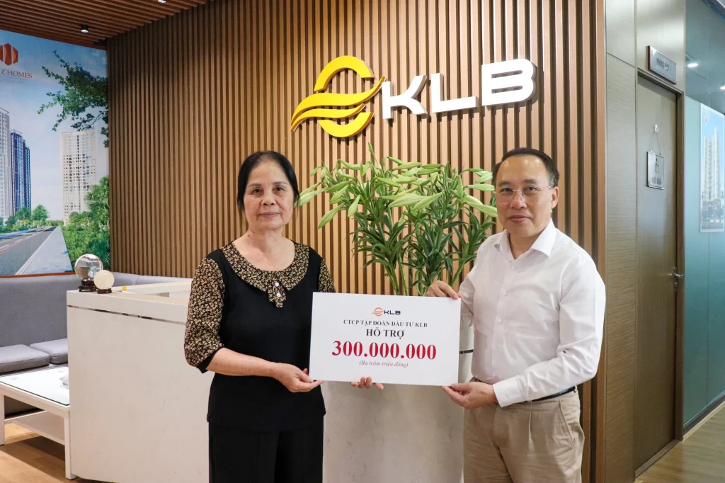
Relentless Aspiration, Reaching New Heights: A Visual Symphony in KLB Group’s New Brand Identity
In the boundless universe of branding, a logo is not merely a mark of recognition — it is a condensed portrait of a company’s soul, a visual embodiment of its vision, philosophy, and boundless ambition. For KLB Group, the new logo is more than just a design — it is a declaration, a visual manifesto echoing our unwavering commitment to “Relentless Aspiration” and the pursuit of excellence.
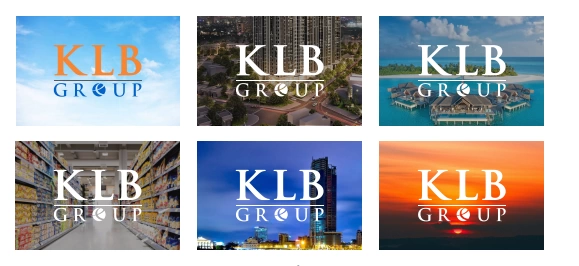
The harmony of letters and symbols – the spirit in motion
Through the perfect harmony between strong typography and symbolic imagery, the logo captures the essence of our transformation. It illustrates our desire to break all boundaries, to explore uncharted frontiers, and to turn bold dreams into shared value — for a happier community and a sustainable future.
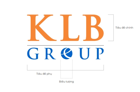
“KLB” – Bold, unwavering, and visionary
At the heart of the logo, the three proud letters “KLB” rise with confidence and strength. Far from being static initials, they represent our pioneering spirit and iron will — the courage to face challenges head-on. Rendered in bold, solid strokes, they symbolize a trustworthy organization with a clear direction and powerful inner strength.
The vibrant orange of passion, the blue of boundless hope
The choice of bright orange as the main color of “KLB” is far from random. It represents positivity, creativity, and a burning drive to exceed all limits. This is the color of bold innovators, of those who dare to shape a brighter future — the beating heart of a group that never stops reaching for the sky.
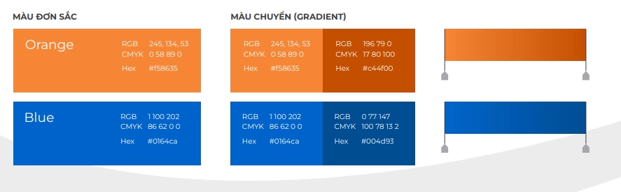
Meanwhile, the word “GROUP”, dressed in a calm blue, evokes professionalism, unity, and sustainability. It reflects an open mindset, a long-term vision, and a strong connection to global values. This balance between the energetic orange and the steadfast blue creates a visual symphony of passion and purpose — the very spirit of KLB people: Resilient in strength – Open in thought – Human-centered in action.
A global rhythm in the symphony of economic prosperity
The globe symbol, embracing the typography, speaks to global connectivity and KLB’s aspiration to go beyond national borders. It reflects our ambition to integrate into the global economy, build lasting partnerships, and shape a future of shared growth. The circle also conveys unity, continuity, and a sustainable development cycle rooted in core values.
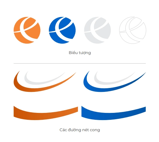
Nestled gracefully within the globe is a stylized “E”, like a distinctive note in a global symphony. Inspired by the Euro currency symbol — a representation of modern, integrated economies — this element highlights KLB’s vision of becoming a sophisticated, international brand, ready to partner with global investors and clients in a spirit of excellence.
A modern beginning — built for every touchpoint
The new KLB logo is elegantly simplified yet thoroughly modern, designed to shine across all digital and physical platforms — from websites and social media to signage, stationery, uniforms, and branded assets. Its balanced structure ensures powerful brand consistency and memorability across all customer and partner interactions.
A symbol of enduring aspiration and global connection
More than a visual mark, KLB’s new logo is a story — one of resilience, ambition, and unwavering aspiration. It reflects a forward-looking mindset, a commitment to global connection, and a belief in a thriving future not only for KLB but for Vietnam and the world. It is the spirit of KLB people: steadfast, innovative, humanistic — always moving forward with a heart full of purpose.
From the heart of Vietnam, KLB rises to the world — with strength, passion, and unshakable belief in the future.
KLB – Creating value together. Shaping tomorrow together!